
O’Sullivans Web Redesign
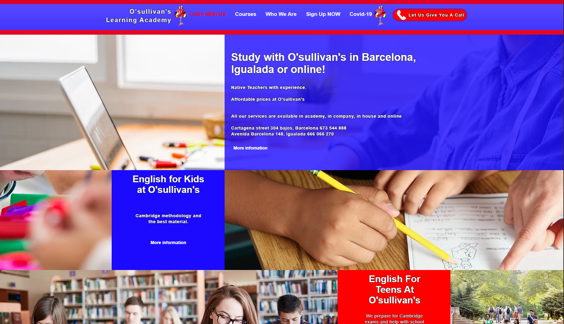
Original Website – Key Issues
The original design of the O’Sullivan’s website lacked clarity and structure, which negatively impacted user experience. The navigation was overcrowded with too many links, making it difficult for users to find the information they needed. The visual hierarchy was weak—important content like CTAs and course descriptions were buried within long paragraphs and inconsistent formatting. The layout felt outdated, with poor use of white space, making the site appear cluttered and harder to read. Additionally, there was little visual consistency across sections, and the mobile responsiveness was limited, which could lead to user frustration on smaller devices.
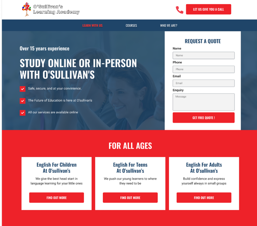
Redesigned Website – Key Improvements
In the redesign, I focused on improving usability, clarity, and overall aesthetics. I created a strong visual hierarchy using consistent typography, spacing, and color contrast. Key information is now easy to find, with clearly structured sections such as “For All Ages” and “More Than Just an English Academy.” CTAs are prominent and repeated throughout the page to boost engagement. I simplified the navigation to focus on the main user paths and made the design fully responsive for all devices. I also introduced visual elements like icons and images to support the content and enhance scannability. Overall, the redesign delivers a modern, user-centered experience that aligns with the school’s identity and makes it easier for users to take action.
Prototype Here
Key UX design points
Clear Visual Hierarchy
I structured the layout with strong visual contrast, spacing, and sectioning to guide users through the content naturally. Key calls to action like “Request a Quote” and “Let Us Call You” are prominently positioned and visually distinct.
Mobile-First, Responsive Design
I prioritized a layout that adapts well to mobile and tablet screens, ensuring readability and functionality across all devices. Key sections stack cleanly and buttons are thumb-friendly for smaller screens.
Use of Icons and Visual Aids
I added icons and visuals (e.g., smiley face, graduation cap) to enhance scannability and support content, making the information more digestible and engaging.
Footer Reorganization
I created a more functional footer, separating quick links, services, and contact details for easy access. This ensures that users can find what they need even at the bottom of the page.
Stronger Call-to-Action Focus
I introduced clearer, repeated CTAs in strategic positions across the page to increase conversion opportunities. Buttons are visually bold, with consistent wording and placement to drive user interaction.
Stronger Content Grouping
Content is now grouped into logical categories like “For All Ages,” “Other Languages,” and “In the City,” making it easier for users to scan and understand the services offered.
Reinforced Brand Identity
I used consistent color schemes (red, blue, white) and typography to reinforce O’Sullivan’s branding throughout the page. Custom illustrations and photos were selected to reflect their friendly and professional tone.
Simplified Navigation
I simplified the main navigation by focusing on the essential areas: “Learn With Us,” “Courses,” and “Who We Are.” This makes it easier for users to find what they’re looking for without overwhelming them with too many options.
Improved Form Usability
I redesigned the quote request form with better alignment, field clarity, and a single CTA button (“Get Free Quote”) to make the process more intuitive and reduce friction.
Content Modernization
I rewrote and reformatted several content blocks for brevity and clarity. This improved the overall reading experience and made the value propositions stand out more.
Let’s work together
loisaparicioalvaro@gmail.com
+34 689 681 666

O’Sullivans Web Redesign
Original Website – Key Issues
The original design of the O’Sullivan’s website lacked clarity and structure, which negatively impacted user experience. The navigation was overcrowded with too many links, making it difficult for users to find the information they needed. The visual hierarchy was weak—important content like CTAs and course descriptions were buried within long paragraphs and inconsistent formatting. The layout felt outdated, with poor use of white space, making the site appear cluttered and harder to read. Additionally, there was little visual consistency across sections, and the mobile responsiveness was limited, which could lead to user frustration on smaller devices.
Redesigned Website – Key Improvements
In the redesign, I focused on improving usability, clarity, and overall aesthetics. I created a strong visual hierarchy using consistent typography, spacing, and color contrast. Key information is now easy to find, with clearly structured sections such as “For All Ages” and “More Than Just an English Academy.” CTAs are prominent and repeated throughout the page to boost engagement. I simplified the navigation to focus on the main user paths and made the design fully responsive for all devices. I also introduced visual elements like icons and images to support the content and enhance scannability. Overall, the redesign delivers a modern, user-centered experience that aligns with the school’s identity and makes it easier for users to take action.
Prototype Here
Key UX design points
Clear Visual Hierarchy
I structured the layout with strong visual contrast, spacing, and sectioning to guide users through the content naturally. Key calls to action like “Request a Quote” and “Let Us Call You” are prominently positioned and visually distinct.
Mobile-First, Responsive Design
I prioritized a layout that adapts well to mobile and tablet screens, ensuring readability and functionality across all devices. Key sections stack cleanly and buttons are thumb-friendly for smaller screens.
Use of Icons and Visual Aids
I added icons and visuals (e.g., smiley face, graduation cap) to enhance scannability and support content, making the information more digestible and engaging.
Footer Reorganization
I created a more functional footer, separating quick links, services, and contact details for easy access. This ensures that users can find what they need even at the bottom of the page.
Stronger Call-to-Action Focus
I introduced clearer, repeated CTAs in strategic positions across the page to increase conversion opportunities. Buttons are visually bold, with consistent wording and placement to drive user interaction.
Stronger Content Grouping
Content is now grouped into logical categories like “For All Ages,” “Other Languages,” and “In the City,” making it easier for users to scan and understand the services offered.
Reinforced Brand Identity
I used consistent color schemes (red, blue, white) and typography to reinforce O’Sullivan’s branding throughout the page. Custom illustrations and photos were selected to reflect their friendly and professional tone.
Simplified Navigation
I simplified the main navigation by focusing on the essential areas: “Learn With Us,” “Courses,” and “Who We Are.” This makes it easier for users to find what they’re looking for without overwhelming them with too many options.
Improved Form Usability
I redesigned the quote request form with better alignment, field clarity, and a single CTA button (“Get Free Quote”) to make the process more intuitive and reduce friction.
Content Modernization
I rewrote and reformatted several content blocks for brevity and clarity. This improved the overall reading experience and made the value propositions stand out more.
Let’s work together
loisaparicioalvaro@gmail.com
+34 689 681 666